Trend Graph
The Trend Graph is an extended view of your Home screen that includes your logbook entries. You can select a 6, 12, or 24-hour view of your CGM data.
Swipe to the right to see values further in the past or tap the calendar button to jump to a specific date.
Tap the icons in the graph to see more information.
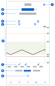
- Notes
- Carbohydrates
- Basal insulin injections
- Bolus insulin injections


- Calendar button: Enables you to select a specific date.
- Indicates Trend Graph is displayed; tap to select a different graph.
- Selected time range
- Notes
- Carbs
- Graphical representation of your glucose values over the selected time range.
- Bolus and basal insulin injections
- Select 6, 12, or 24-hour view
- Tap to see more information on the Trend Graph.
To view your Trend Graph, proceed as follows:
- Tap Graphs.
- Select Trend Graph from the drop-down menu.
- The Trend Graph is displayed.
- Tap the time range you want the graph to represent.
- 6 Hours
- 12 Hours
- 24 Hours