Time in Ranges
The Time in Ranges graph shows what percentage of your glucose values were within each of the 5 ranges (Very High, High, In Range, Low, Very Low) over the last 7, 14, or 28 days.
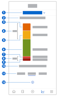
- Indicates Time in Ranges graph is displayed; tap to select a different graph.
- Selected time range
- Very High: Percentage of glucose values that were above your very high glucose limit.
- Combined percentage of glucose values that were above your high/very high glucose limits.
- High: Percentage of glucose values that were above your target range but below your very high glucose limit.
- In Range: Percentage of glucose values that were in your target range.
- Low: Percentage of glucose values that were below your target range but above your very low glucose limit.
- Combined percentage of glucose values that were below your low/very low glucose limits.
- Very Low: Percentage of glucose values that were below your very low glucose limit.
- Duration of time your glucose was below your very low glucose limit.
- Select 7, 14, or 28-day view.
- Tap to see more information on the Time in Ranges graph.
To view your Time in Ranges graph, proceed as follows:
- Tap Graphs.
- Select Time in Ranges from the drop-down menu.
- The Time in Ranges graph is displayed.
- Tap the time range you want the graph to represent.
- 7 Days
- 14 Days
- 28 Days